01. FRONT END
_______________
The front end for "Project Cottonwood" was originally designed by UI/UX and then handed over in order for me to provide an early art treatment. These screens were some of the first tasks I was asked to work on and helped establish an early art style/direction across all UI screens.
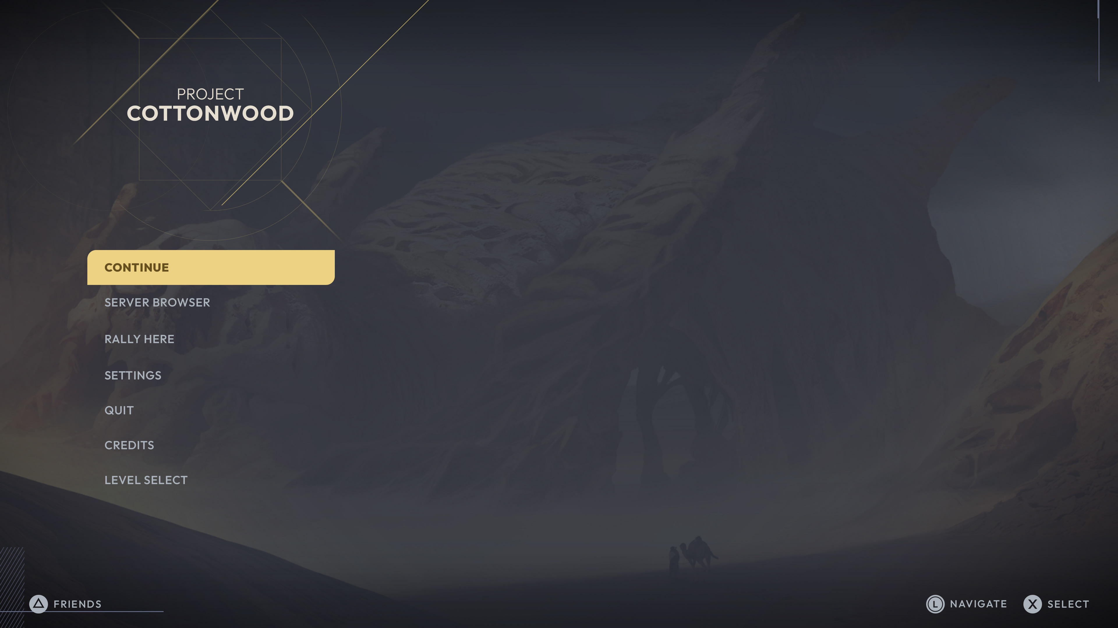
FRONT END
MAIN MENU
FRONT END
SETTINGS SCREEN
_______________
The settings screens were one of the original UI given to me to help provide art treatments for. The layered effect of incorporating modern Arabic Kufic lettering alongside a dot grid and other modern shapes, helped give off a unique and well balanced layout.
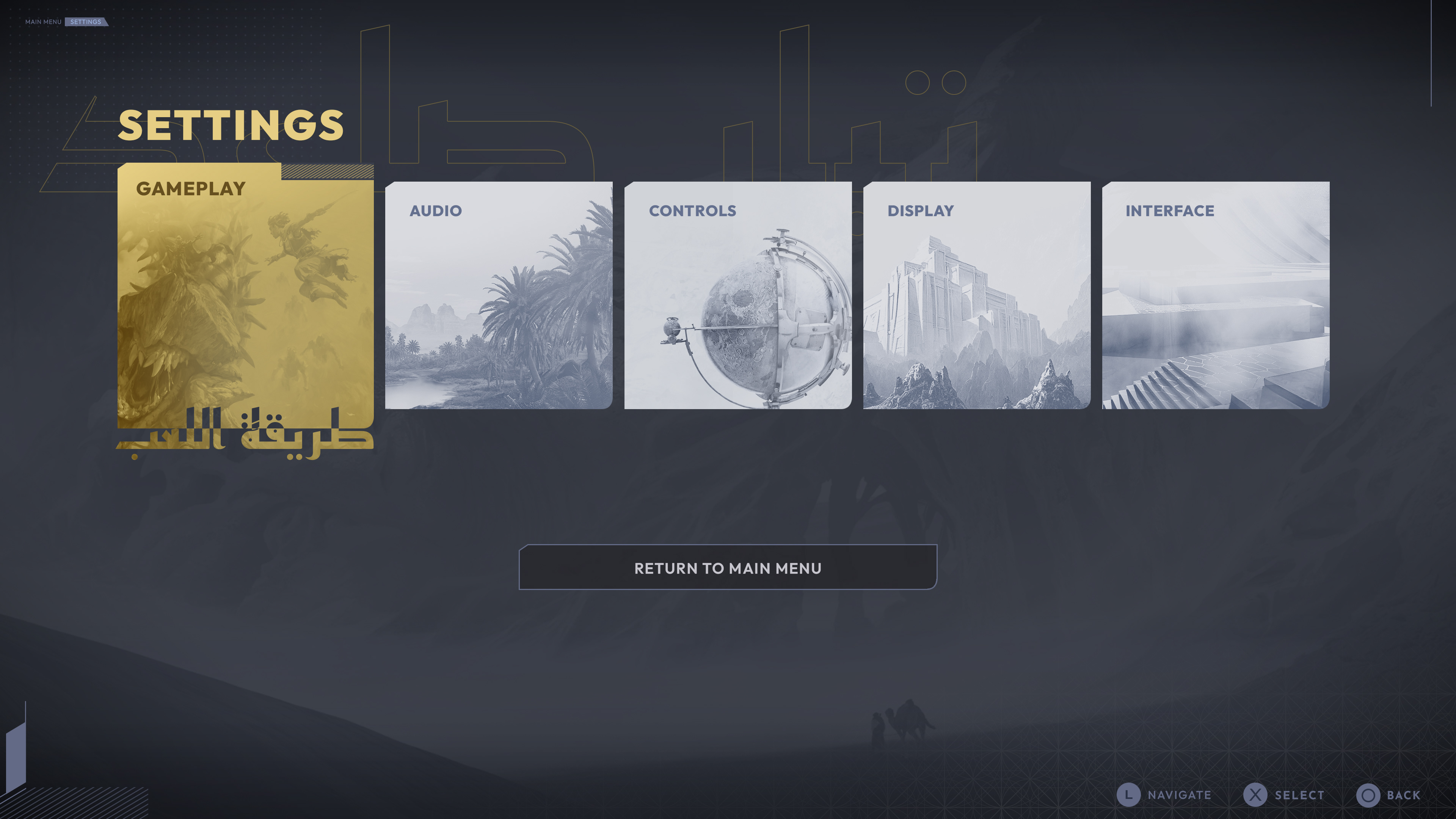
The original idea behind the treatment for these Settings buttons was to transition between English and Arabic design styles (upon hover) - providing a balance between readability and style.


FRONT END
LOADING SCREEN
_______________
Here are some simple animations used for the loading screens, acting as a quick transition between menu's and gameplay - another example of using basic shapes and patterns alongside more traditional geometric patterns.
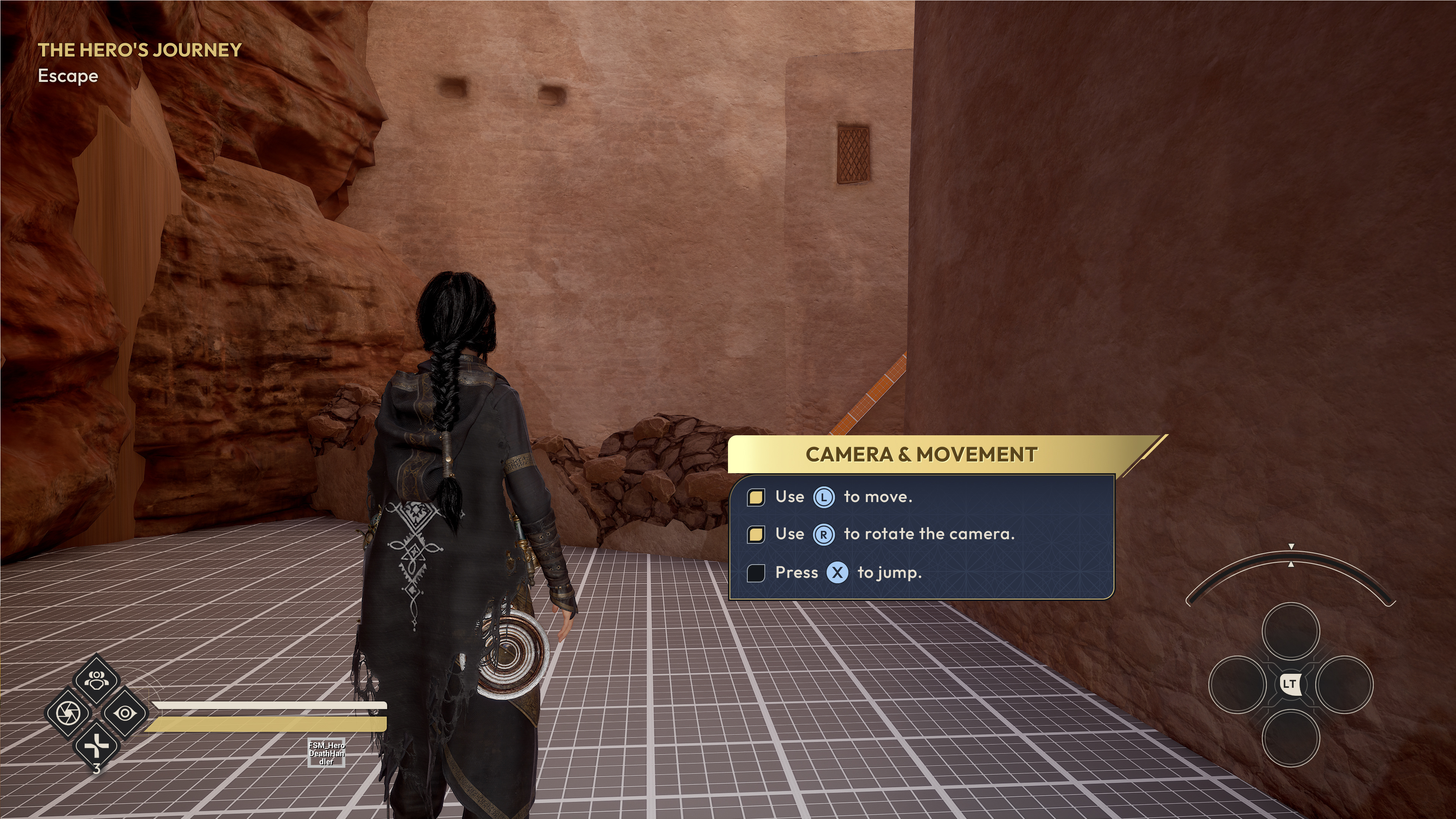
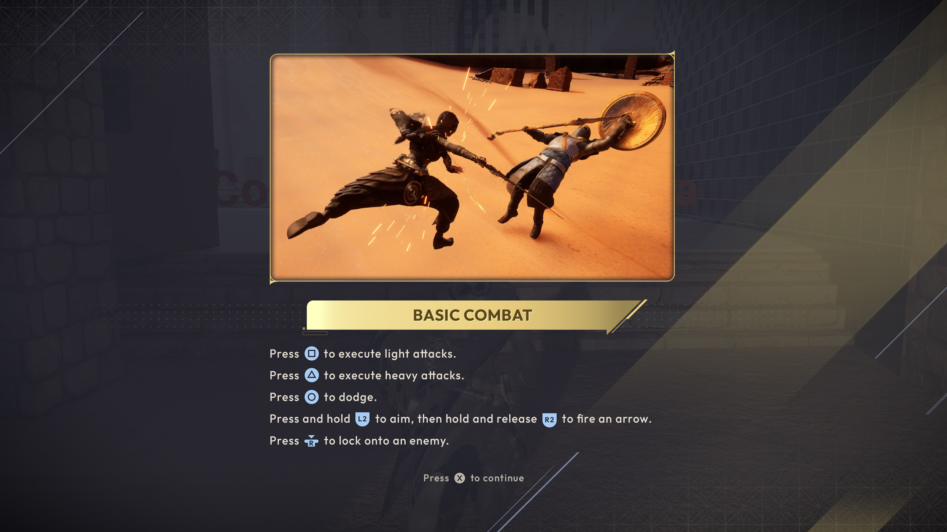
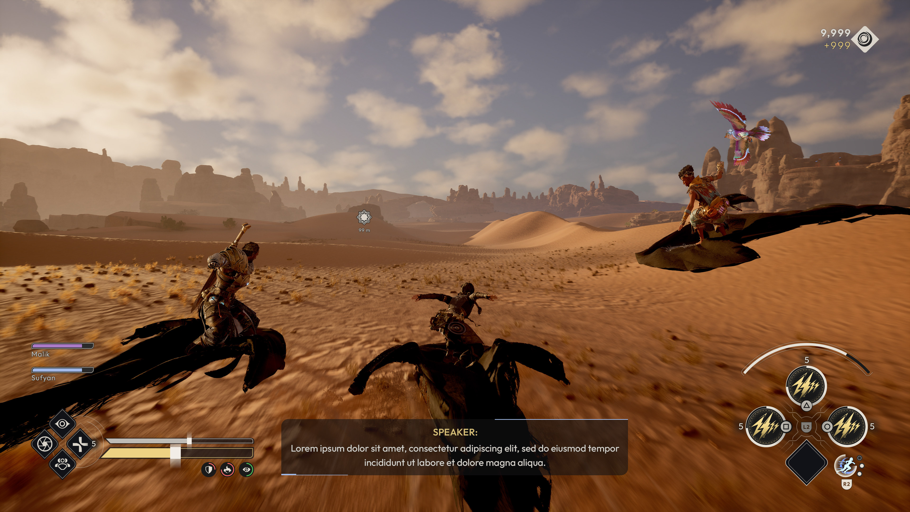
02. IN-GAME
_______________
One of the main priorities across all in-game UI was to retain as much visibility for the player and to not over burden with unnecessary clutter or messaging.
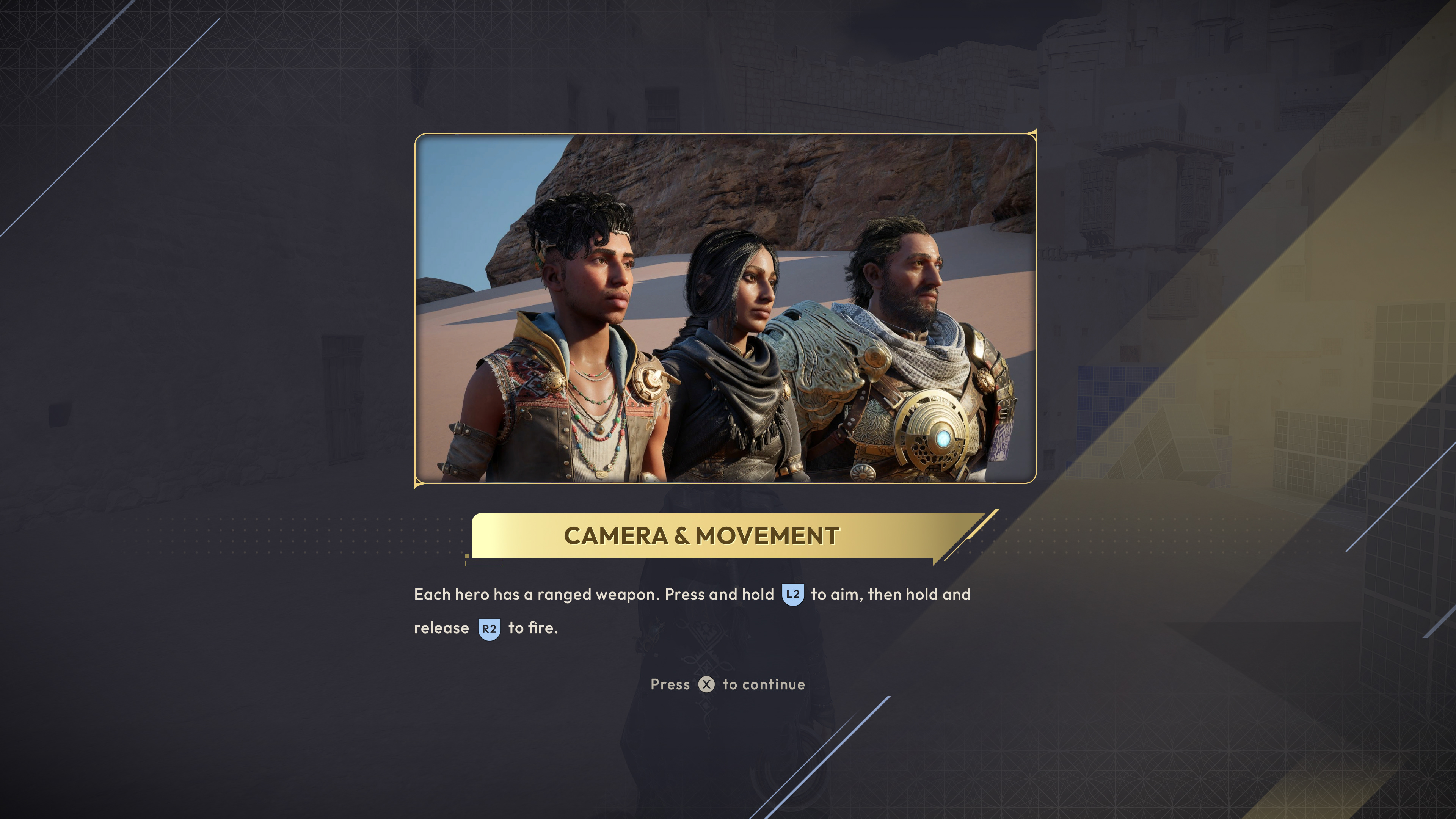
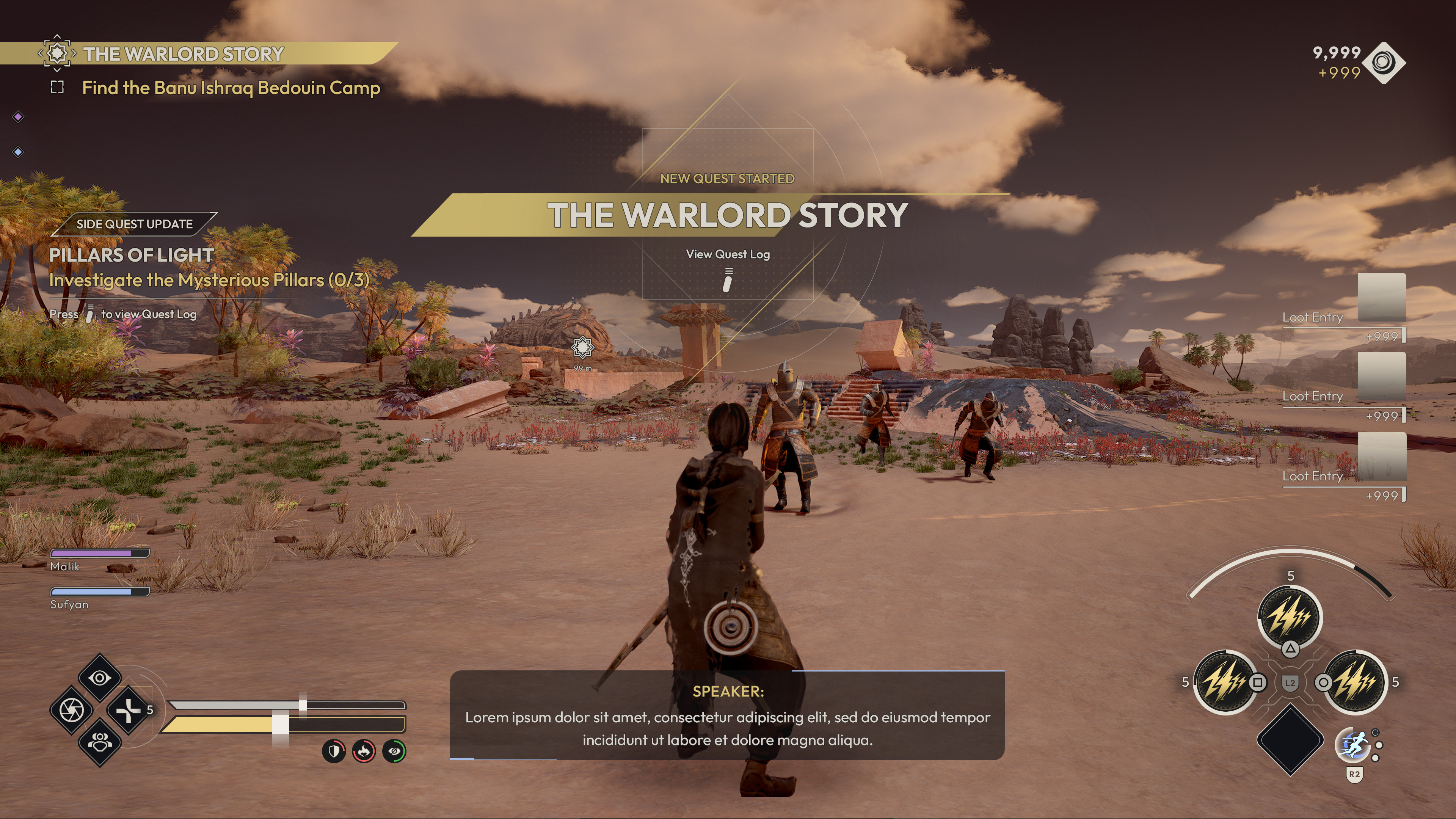
IN-GAME
FTUE (FIRST TIME USER EXPERIENCE)
_______________
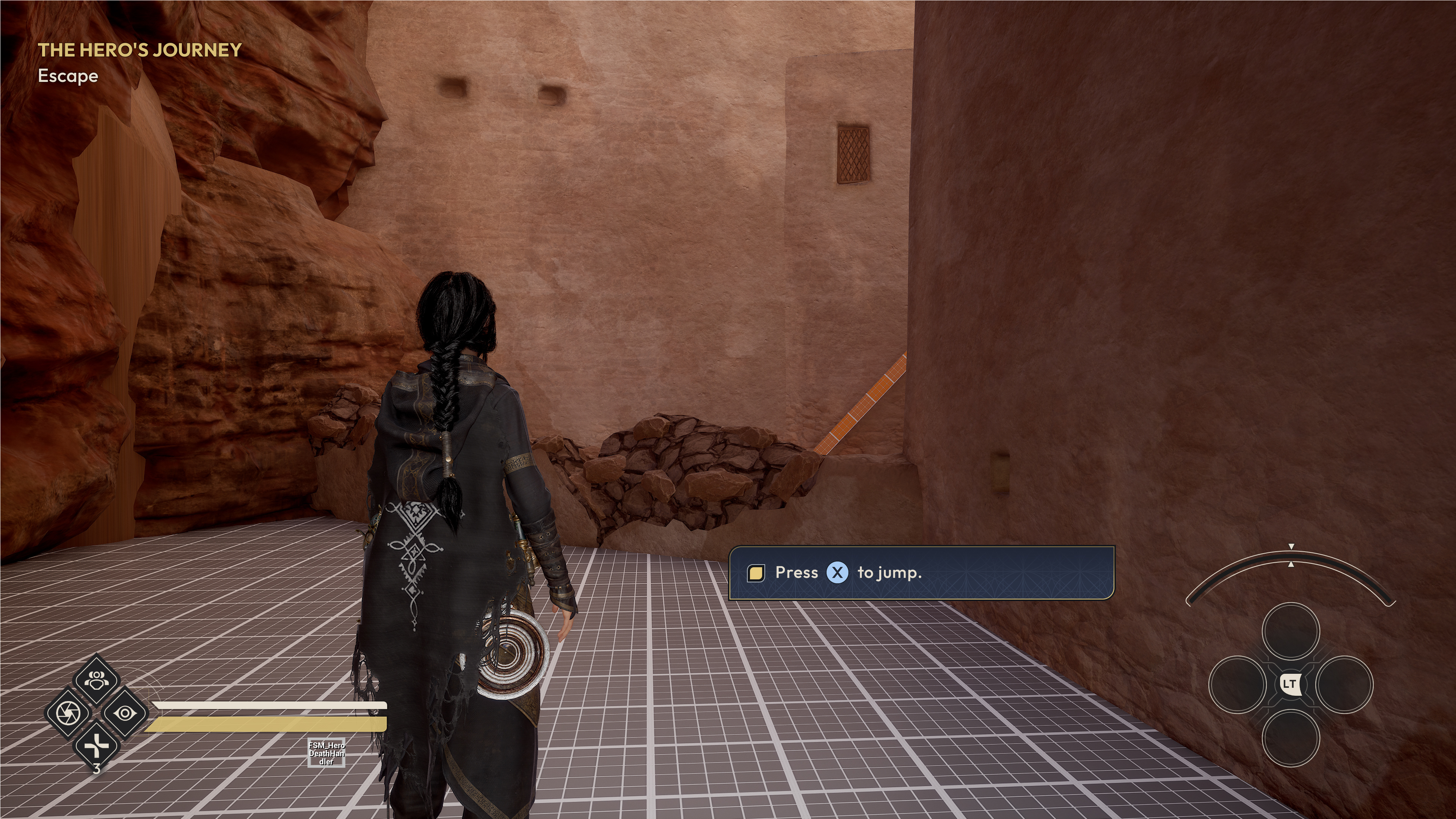
Below are screenshots from the FTUE, offering several flavors of information presented to player in the form of actionable button prompts to carry out as well as fullscreen takeovers. Initially, the recent Jedi Survivor served as the main point of reference for the overall UX during the FTUE portion of the game.
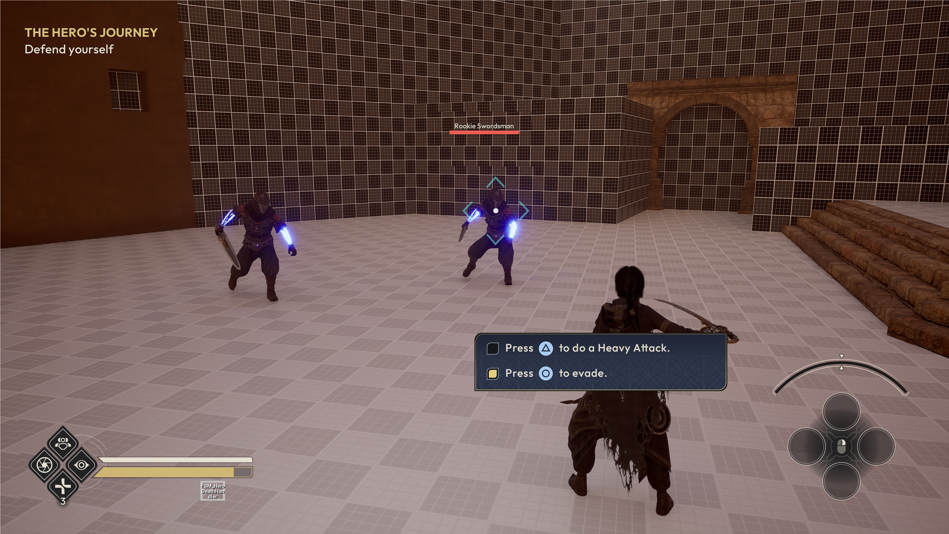
IN-GAME
HUD
_______________
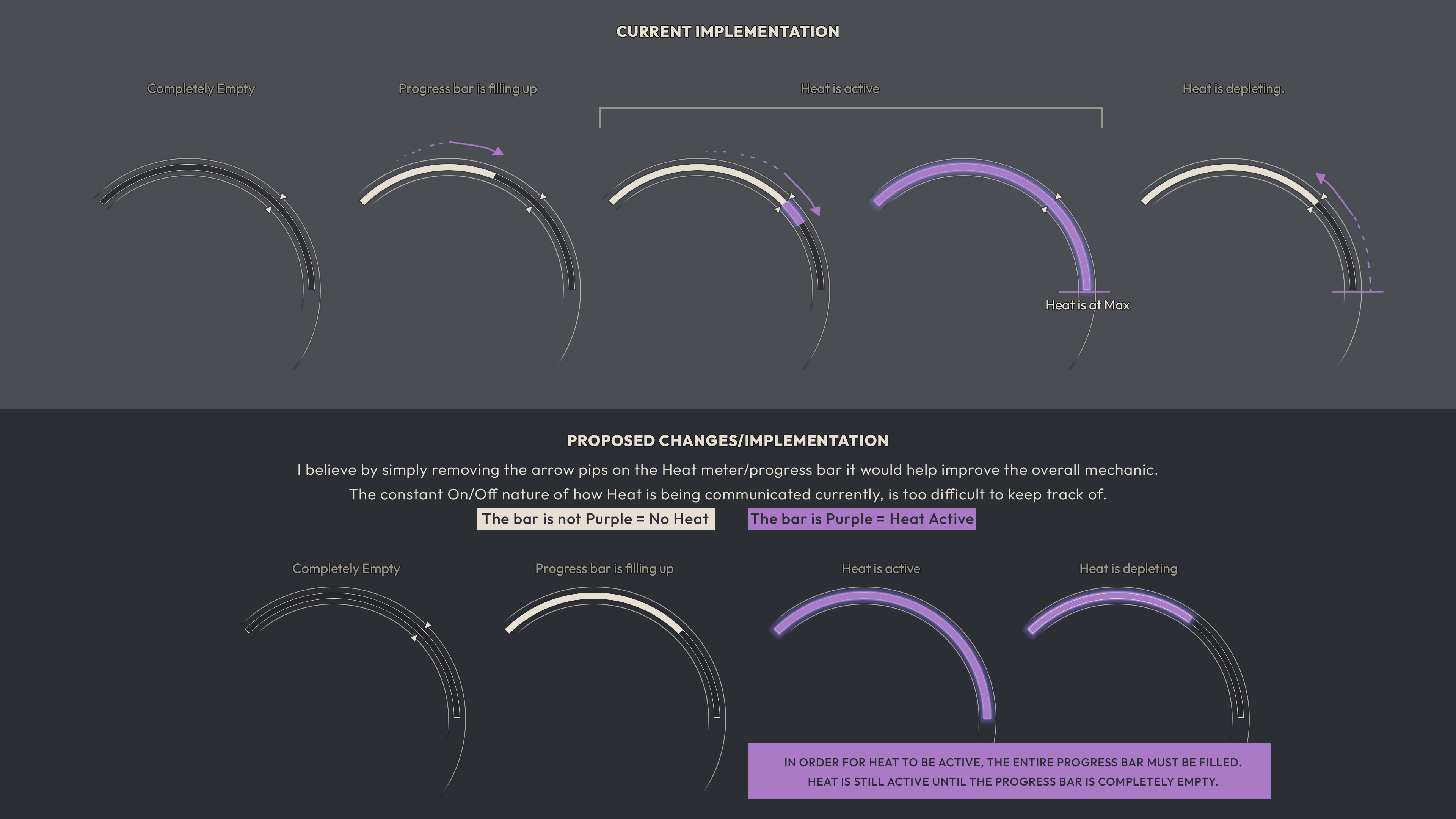
Below are a couple of examples of proposed motion graphics for both a HUD bootup sequence as well as a HUD banner alert. Blending between traditional Arabic sacred geometrical shapes and a more modern/contemporary aesthetic was very fun and creatively fulfilling.
Proposed HUD Bootup Sequence
Proposed HUD Banner Alerts
Full Gameplay HUD
Non-Combat HUD
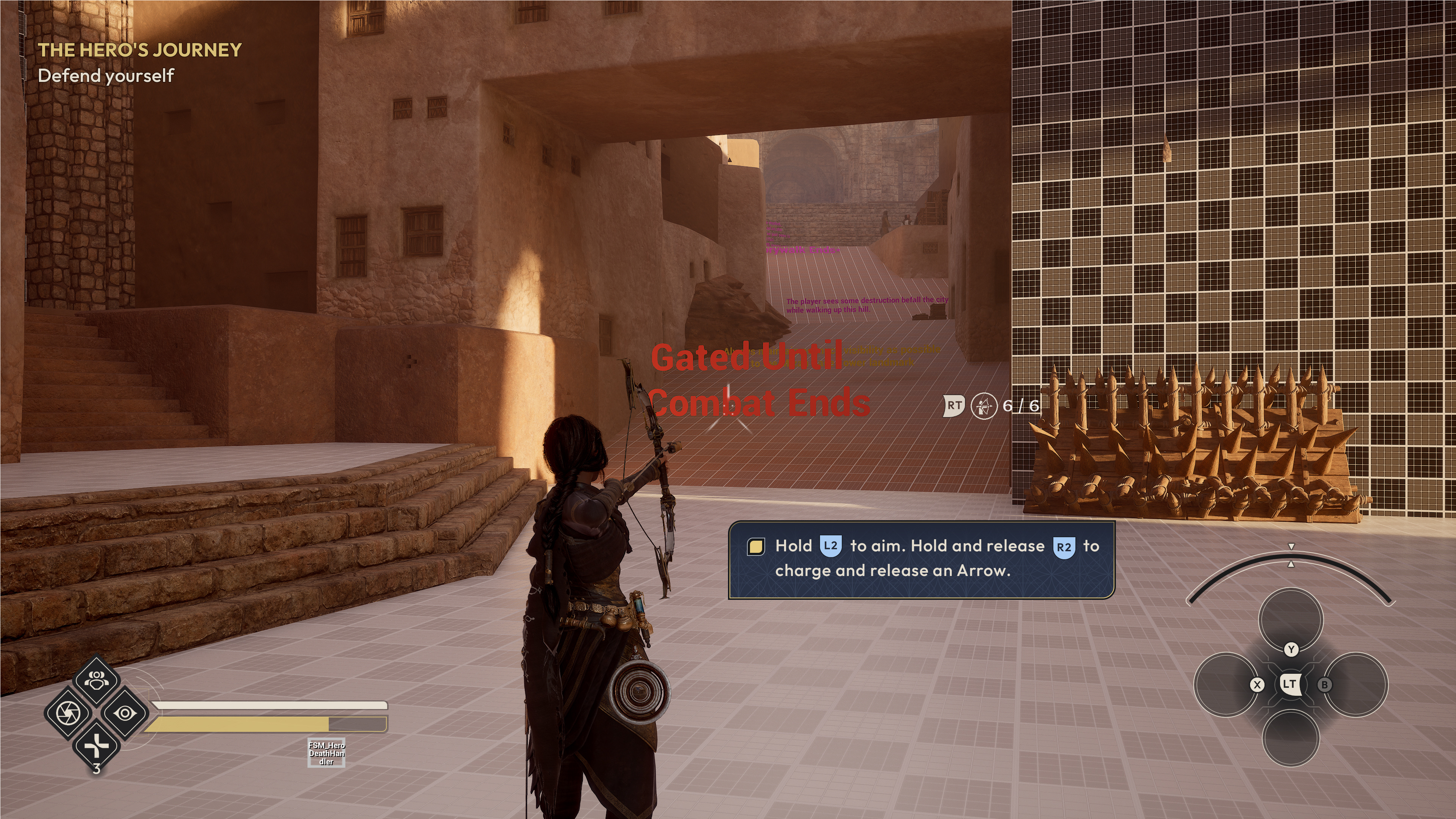
IN-GAME
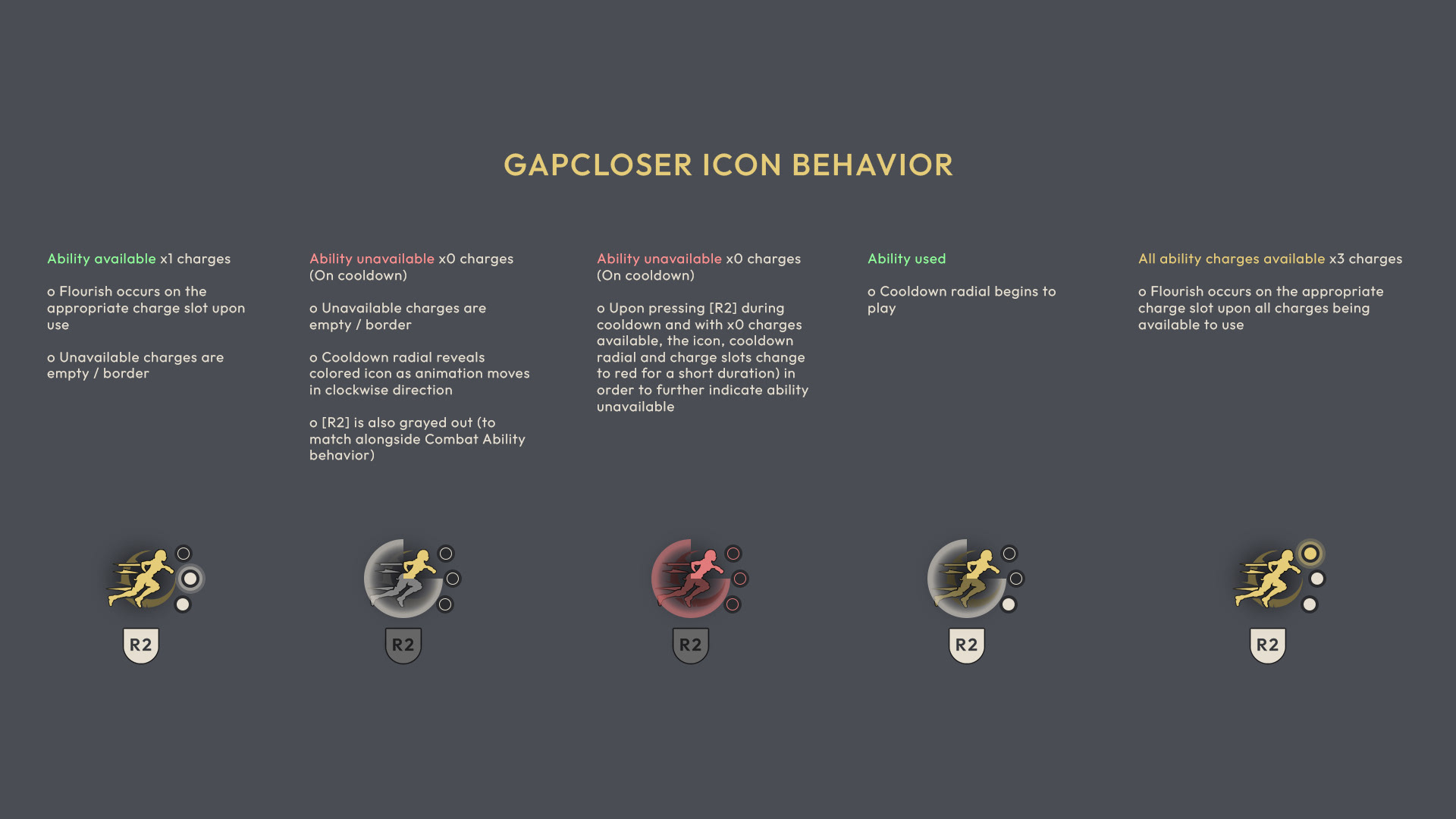
HUD (BOW AIM)
_______________
The bow HUD was an area of the game that I felt needed a bit more attention and modernization, especially given how often players would be in this combat state. In addition to a complete design doc redesign that I wrote, pitched and got green-lit, the comps below help visualize the various states, when entering into this aim mode.
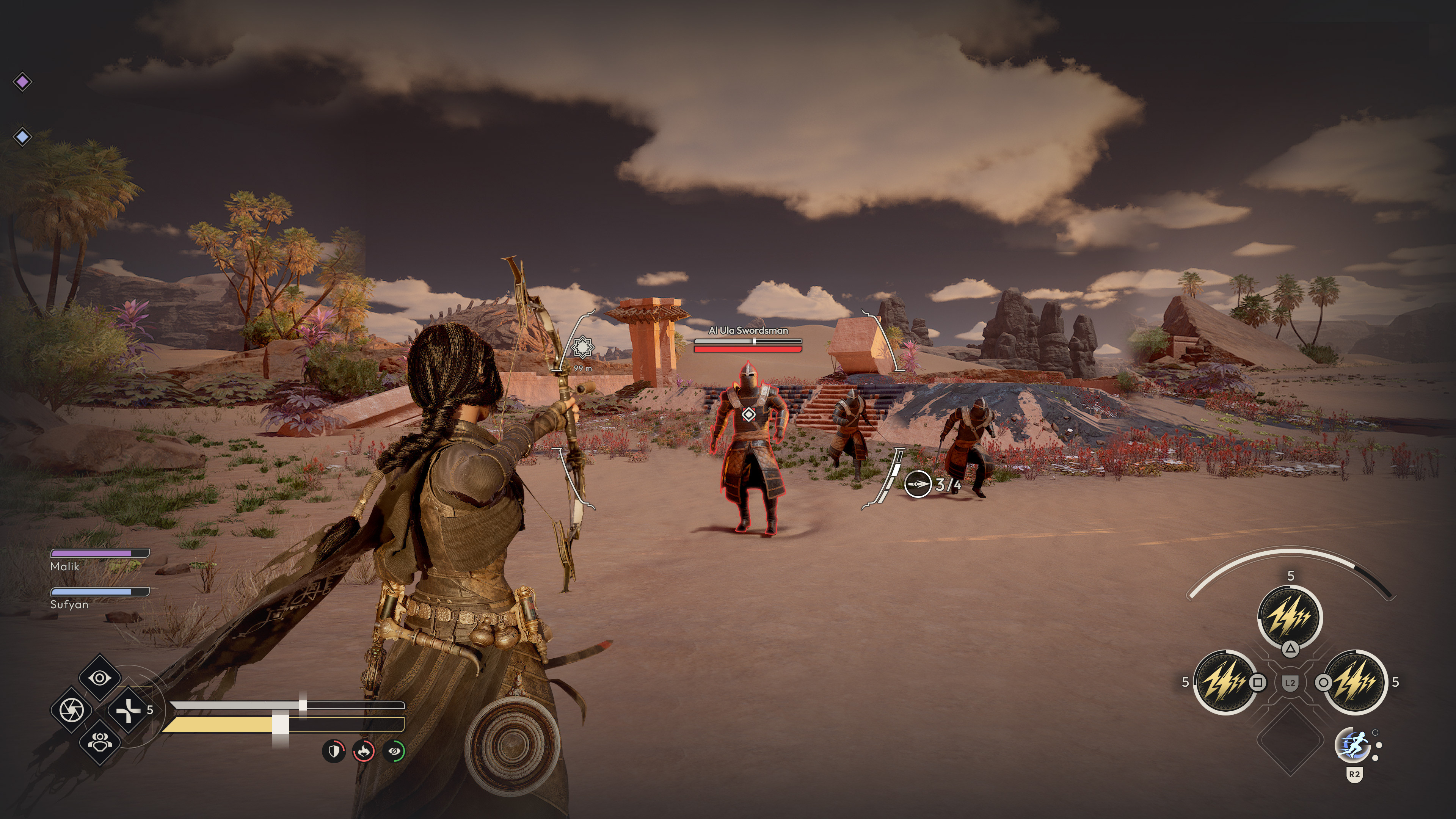
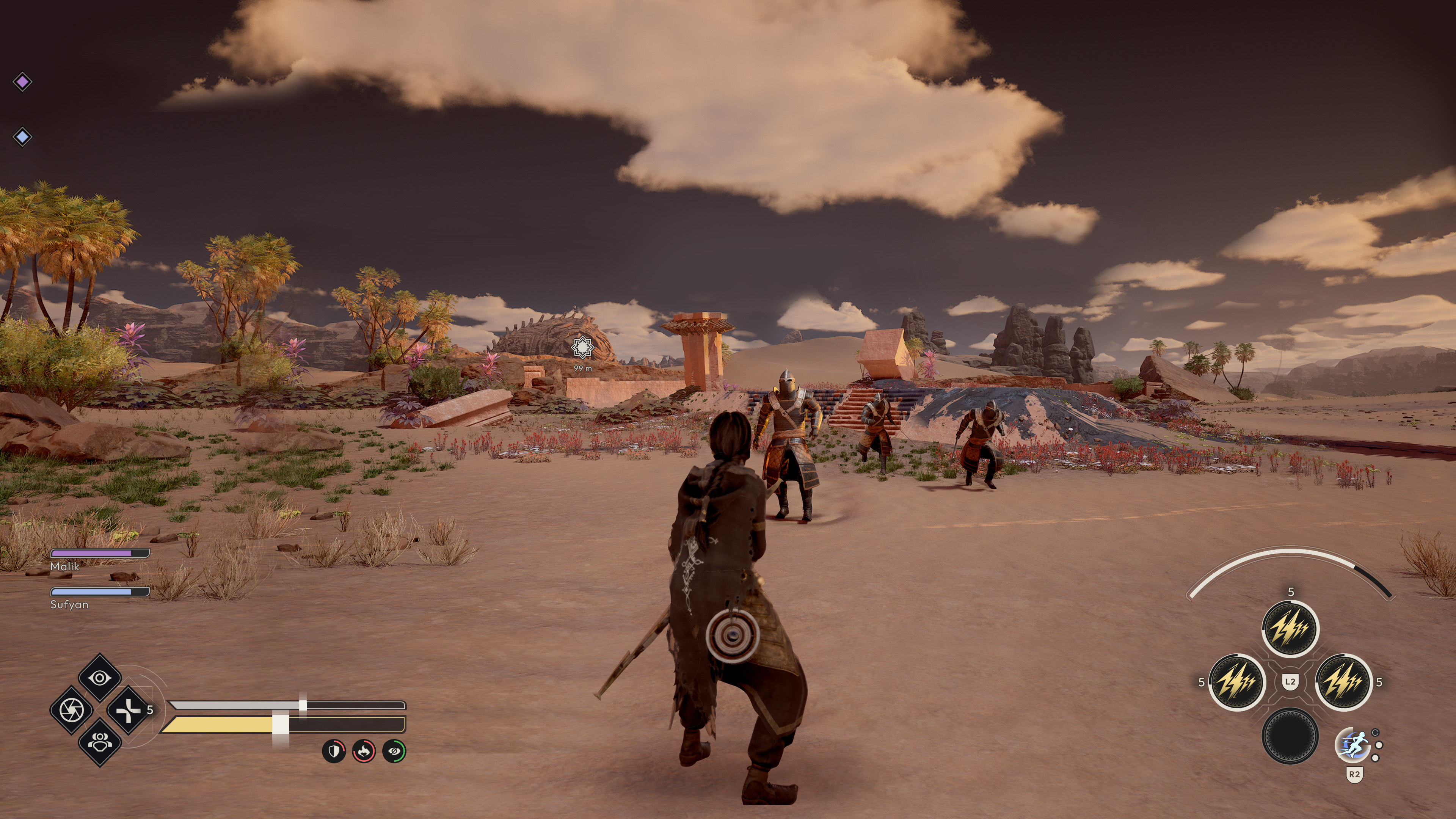
Player character not in range.
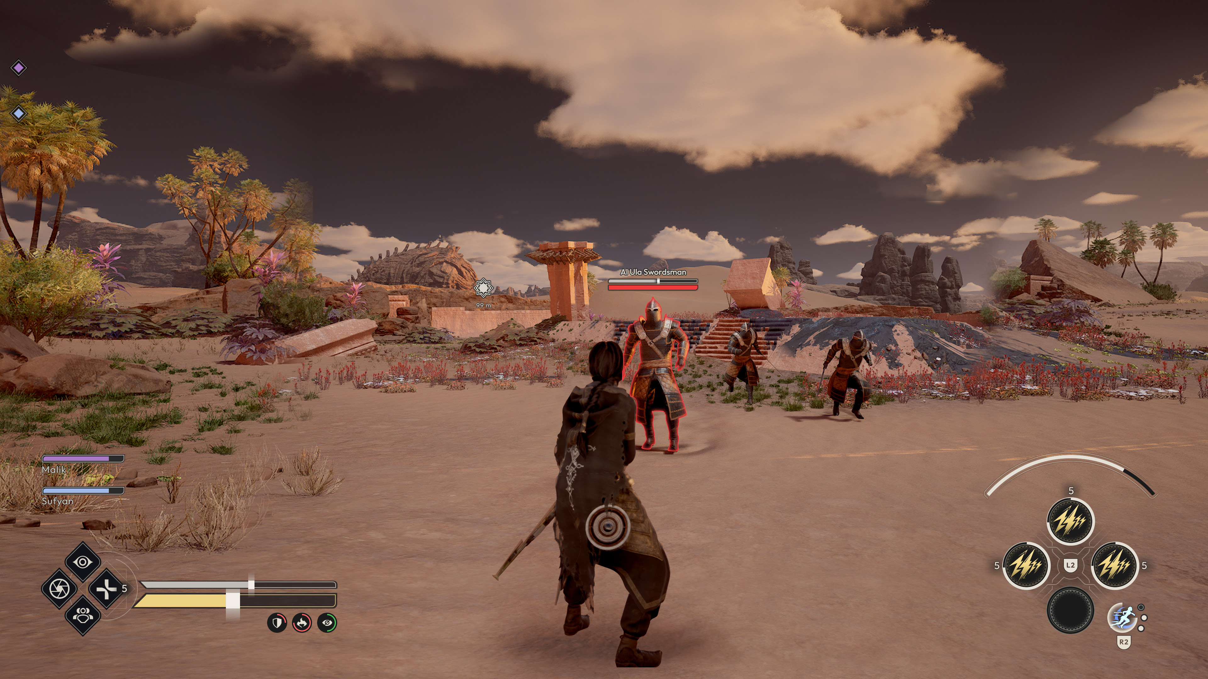
Player character is in range. Enemy within range receives Health, Stamina bars as well as their name appearing above.
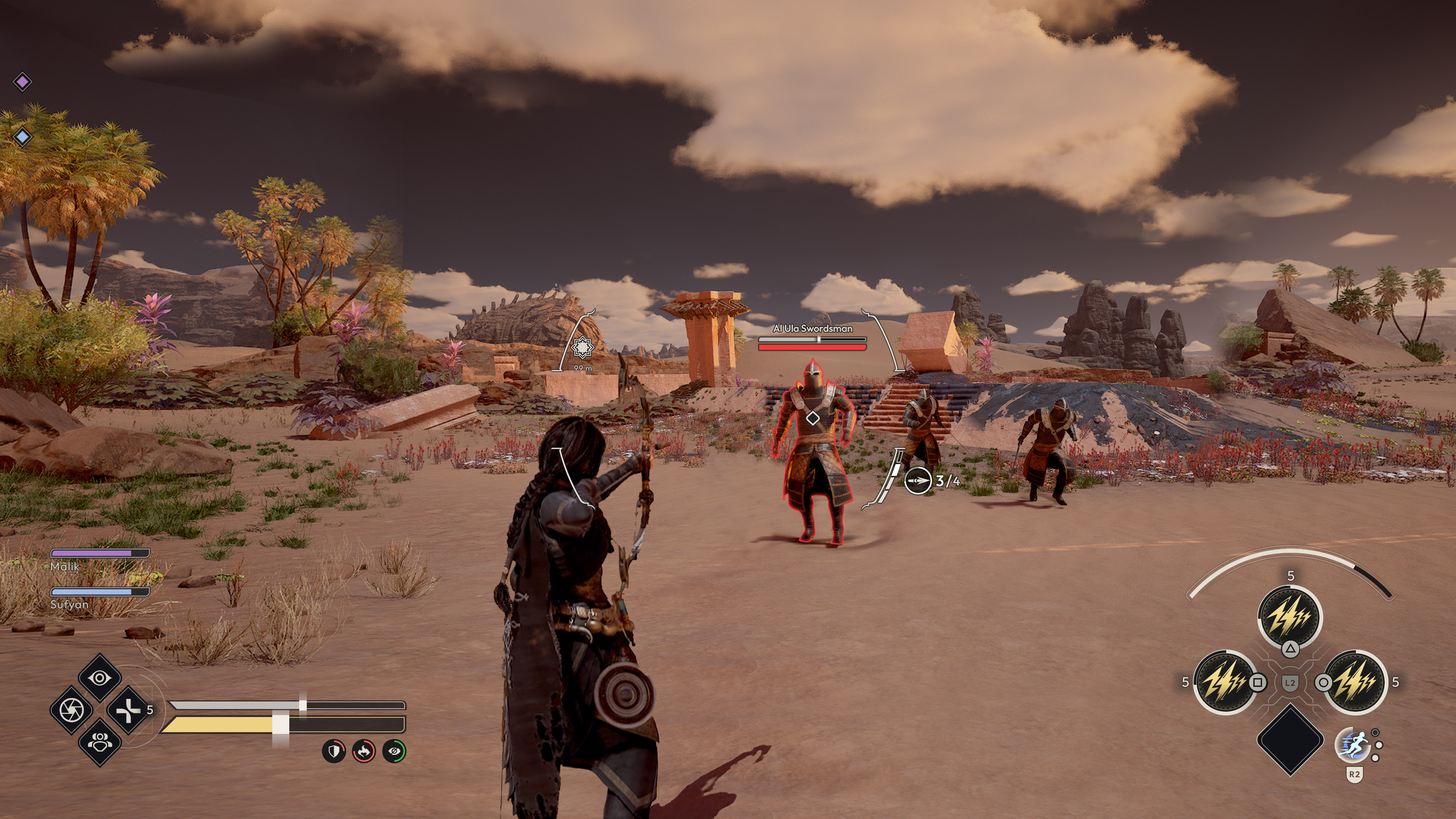
Enemy now has targeting icon attached.

Enemy has been target locked. An additional icon/symbol is present alongside the targeting icon as well as a camera change and vignette.
IN-GAME
MOTION STATES
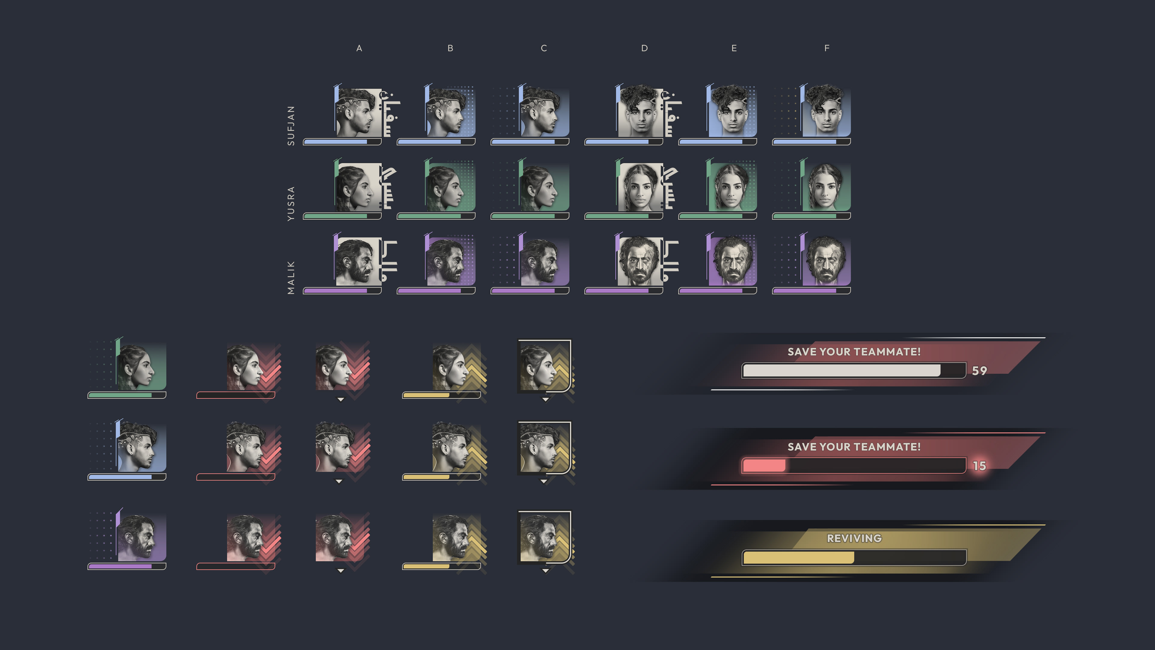
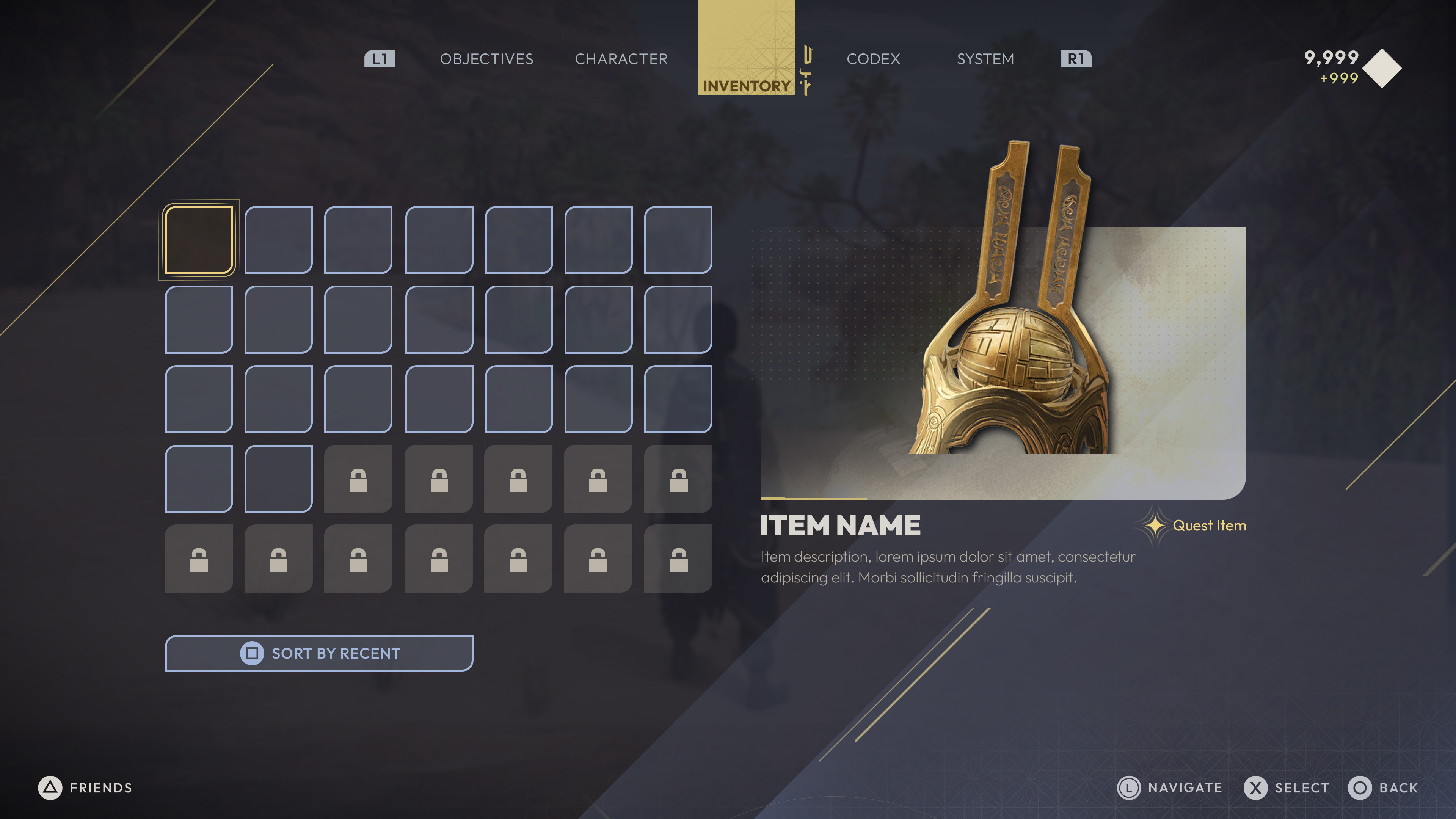
03. PAUSE/CHARACTER SCREEN
_______________
A blade UI is presented to players once they press the assigned key/button. Displayed are fullscreen, transparent windows displaying information such as Objectives, Skills and Abilities, Inventory as well as a Codex and System info.
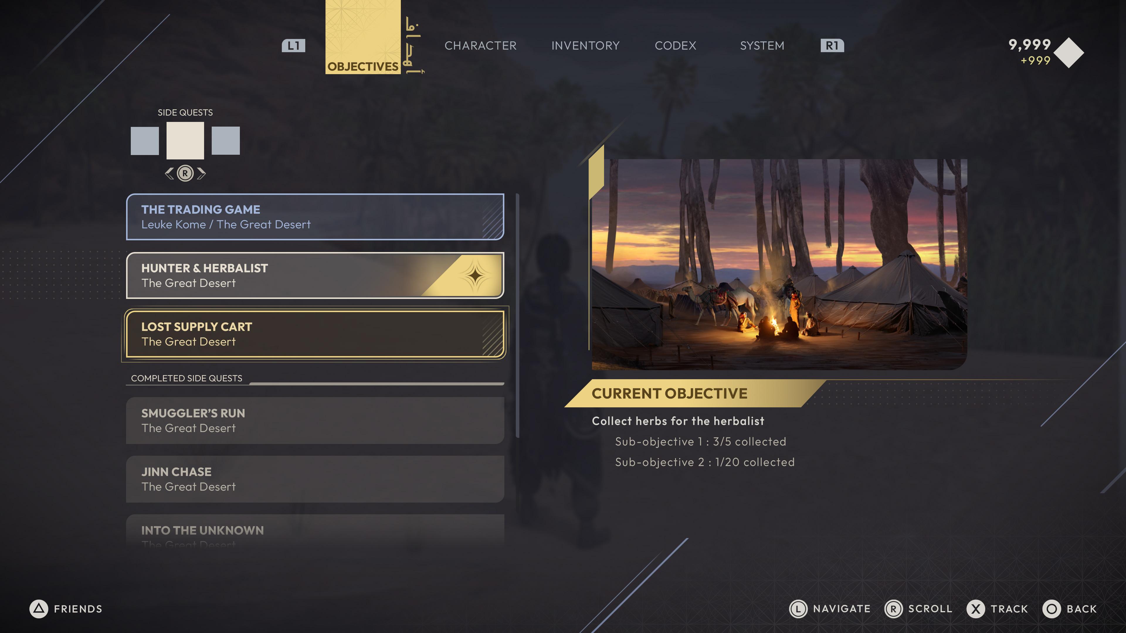
PAUSE/CHARACTER SCREEN
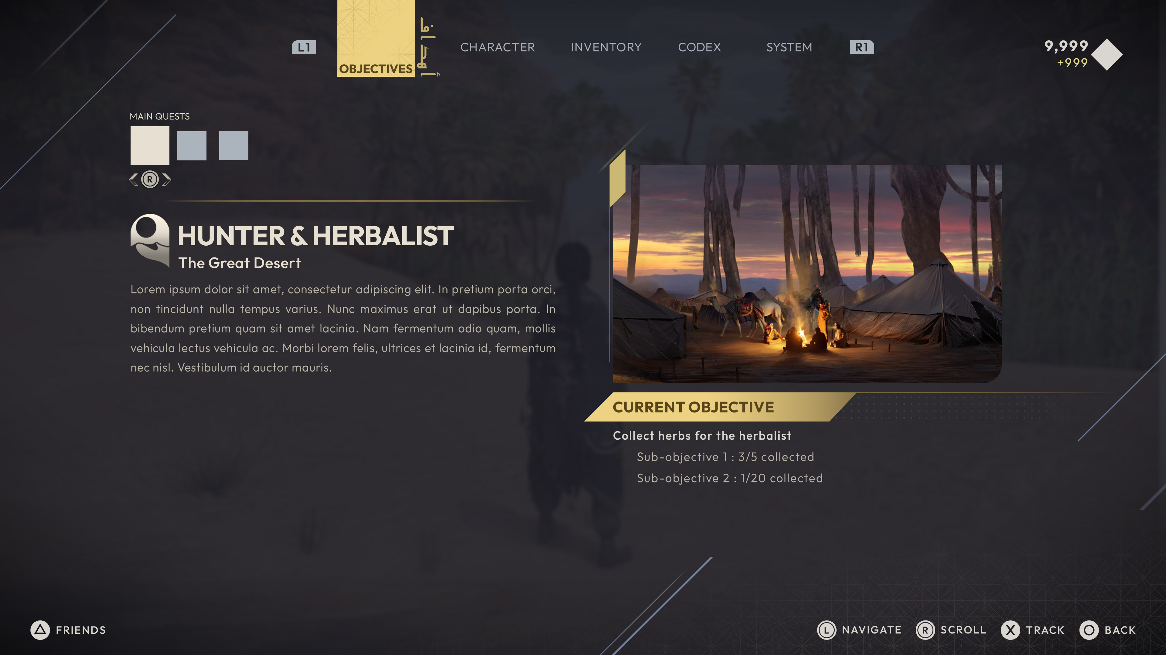
OBJECTIVES
_______________
Players will often be viewing these sets of screen while in the middle of gameplay. Having a simple and intuitive UX was paramount when implementing and testing. There's also conventions.. and we stuck to those.

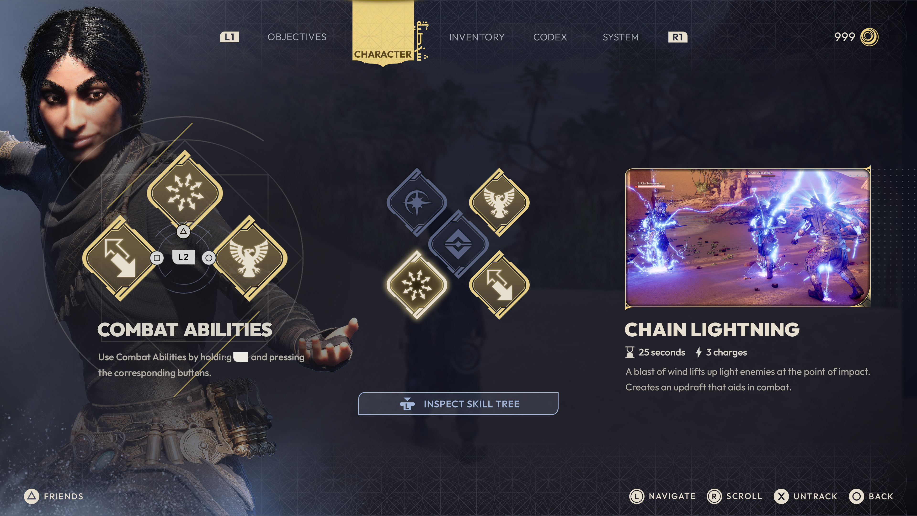
PAUSE/CHARACTER SCREEN
ABILITIES & SKILL TREE
_______________
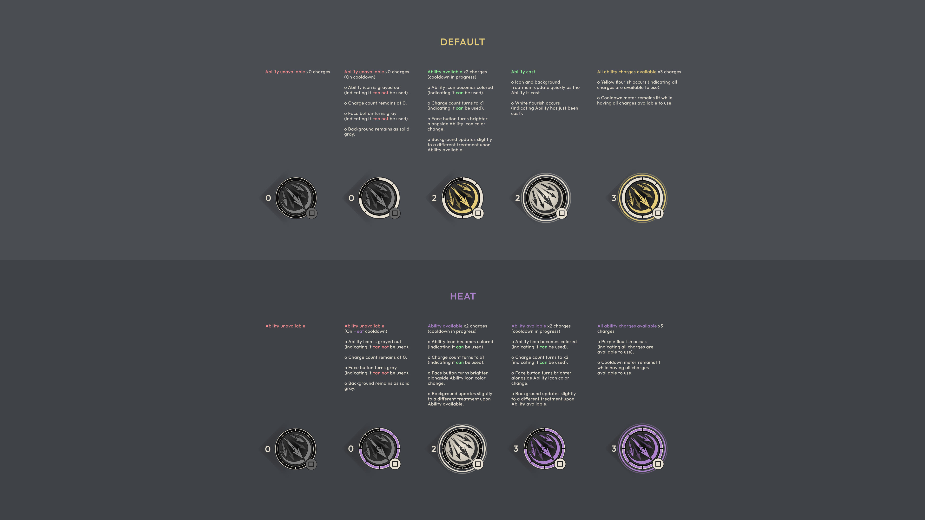
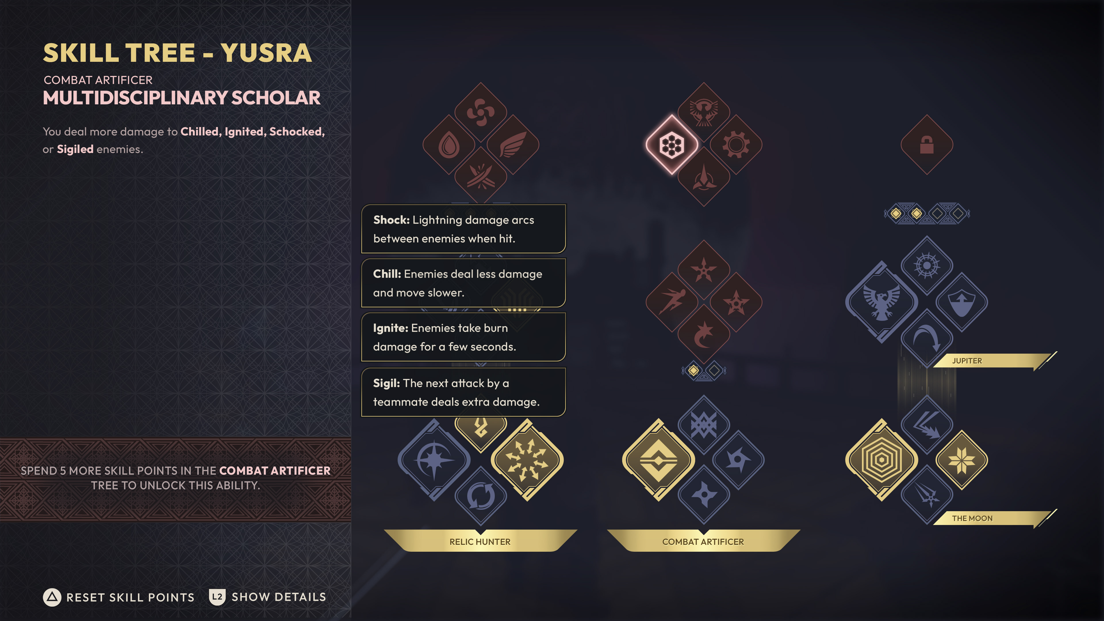
The Abilities and Skill Tree screens were a blast to work on. Having an opportunity to inject a bit more visual flair with these screens was rewarding and allowed me to expand on and repurpose assets previously created. These screens offer well balanced color and shape theory across Unavailable (red), Available (blue), Unlocked (yellow).
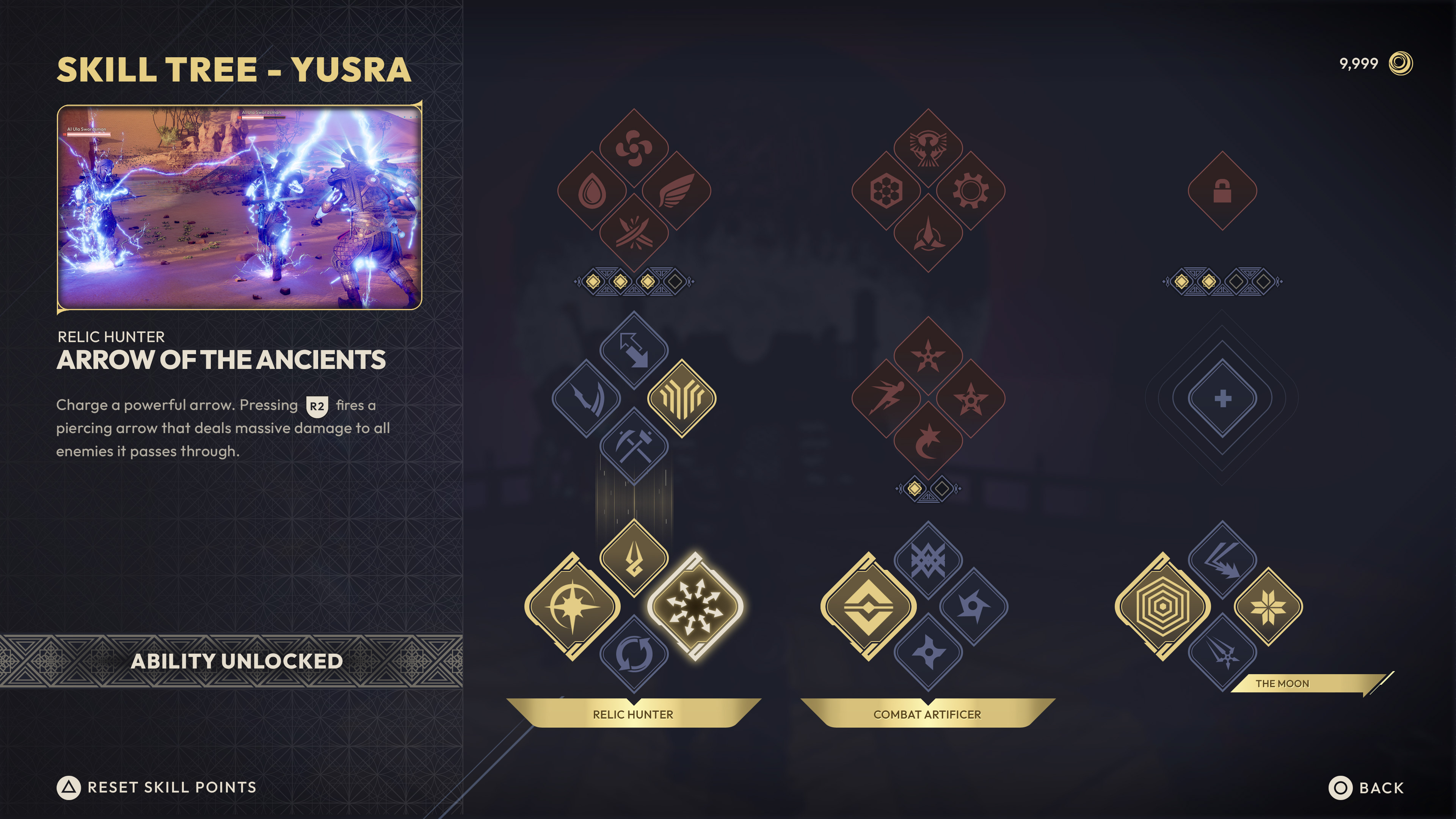
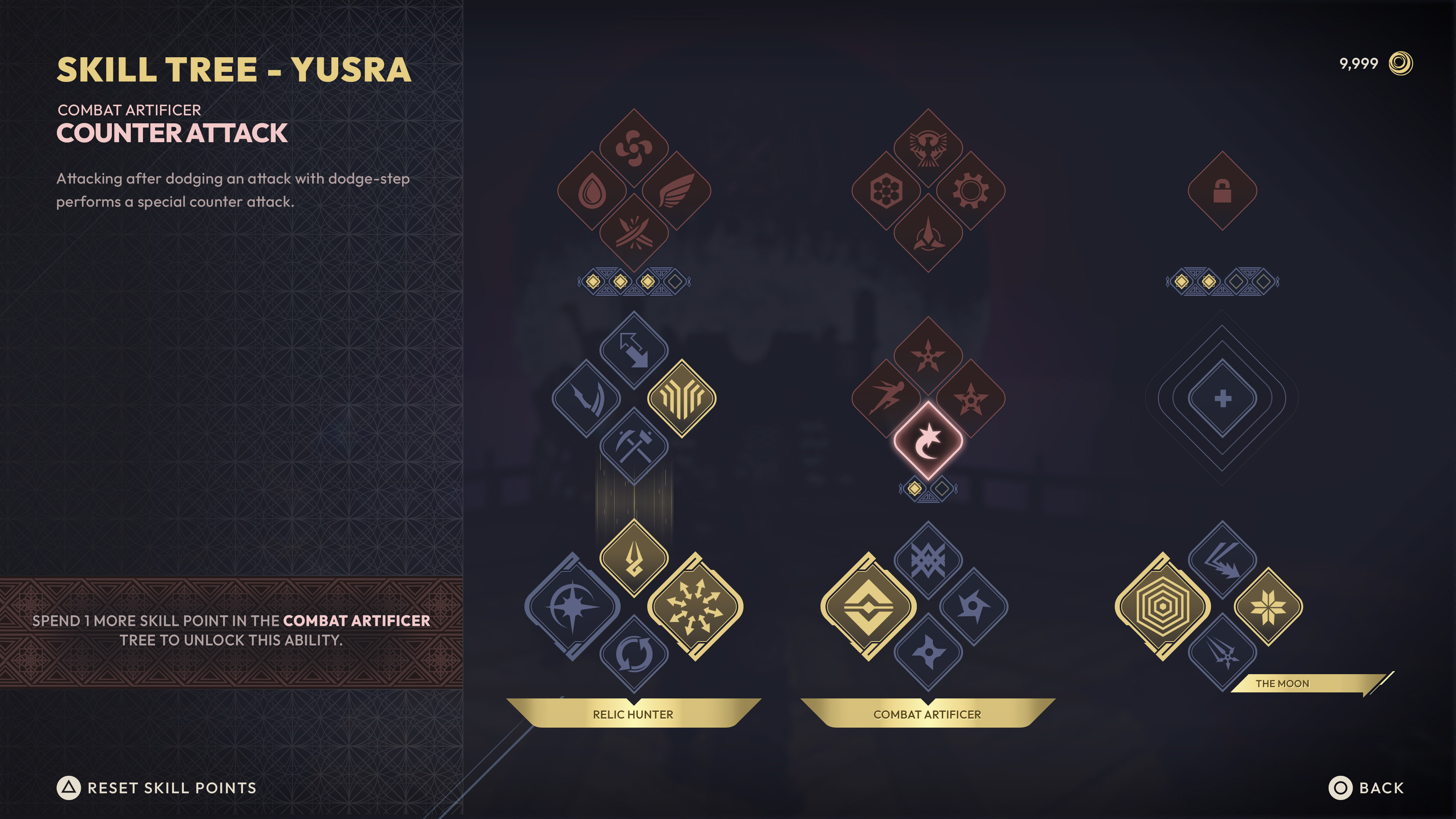

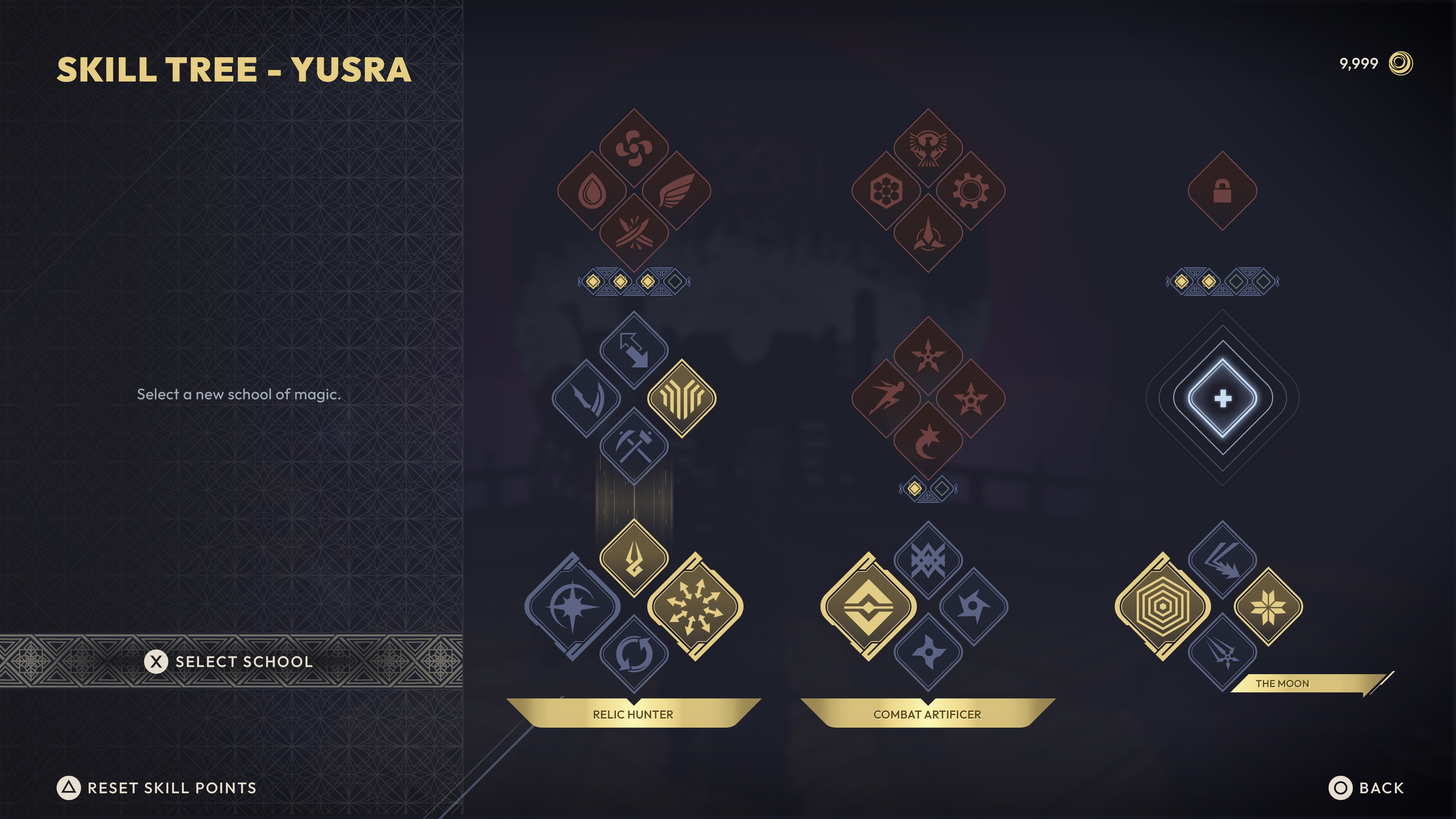
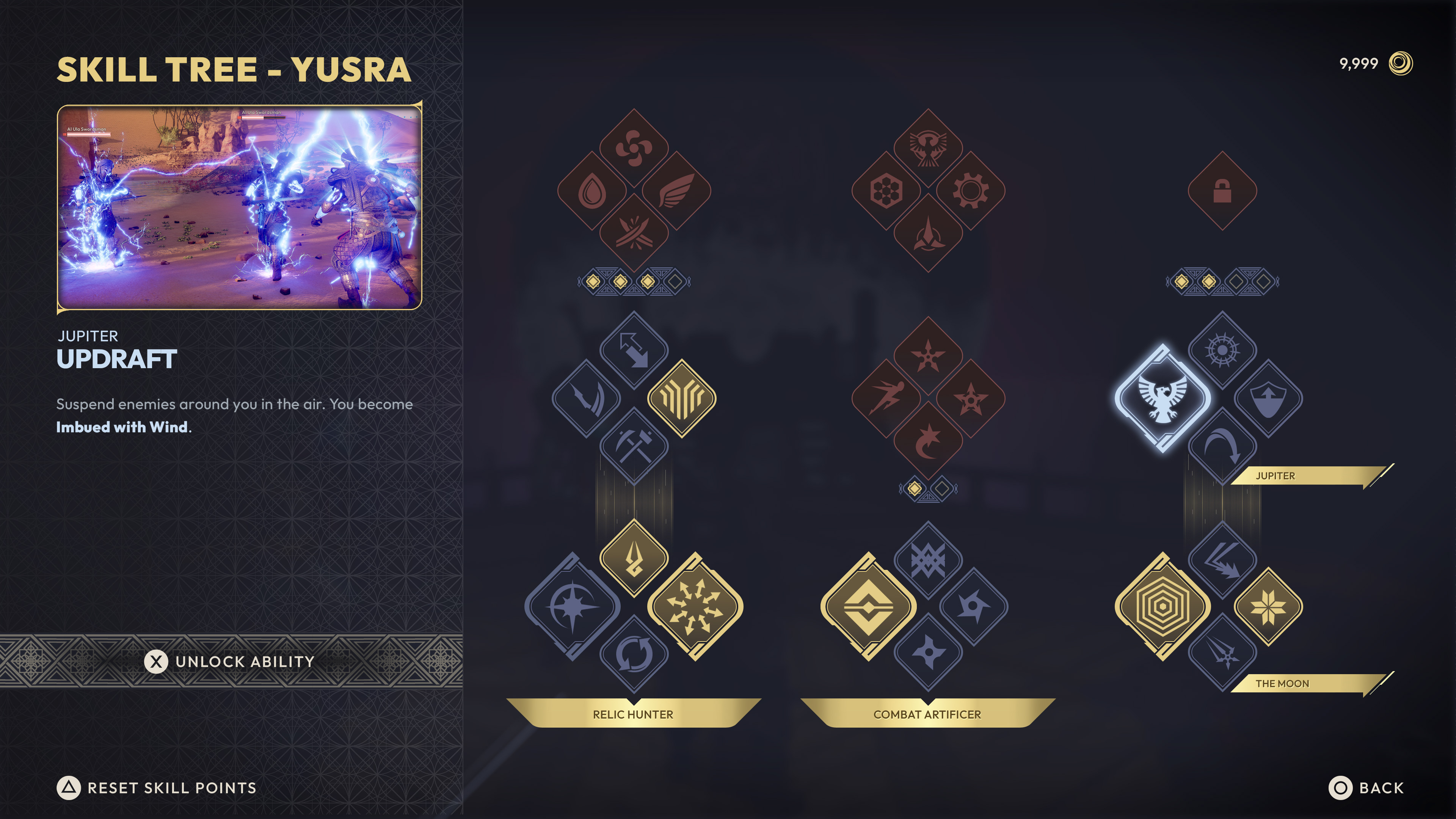
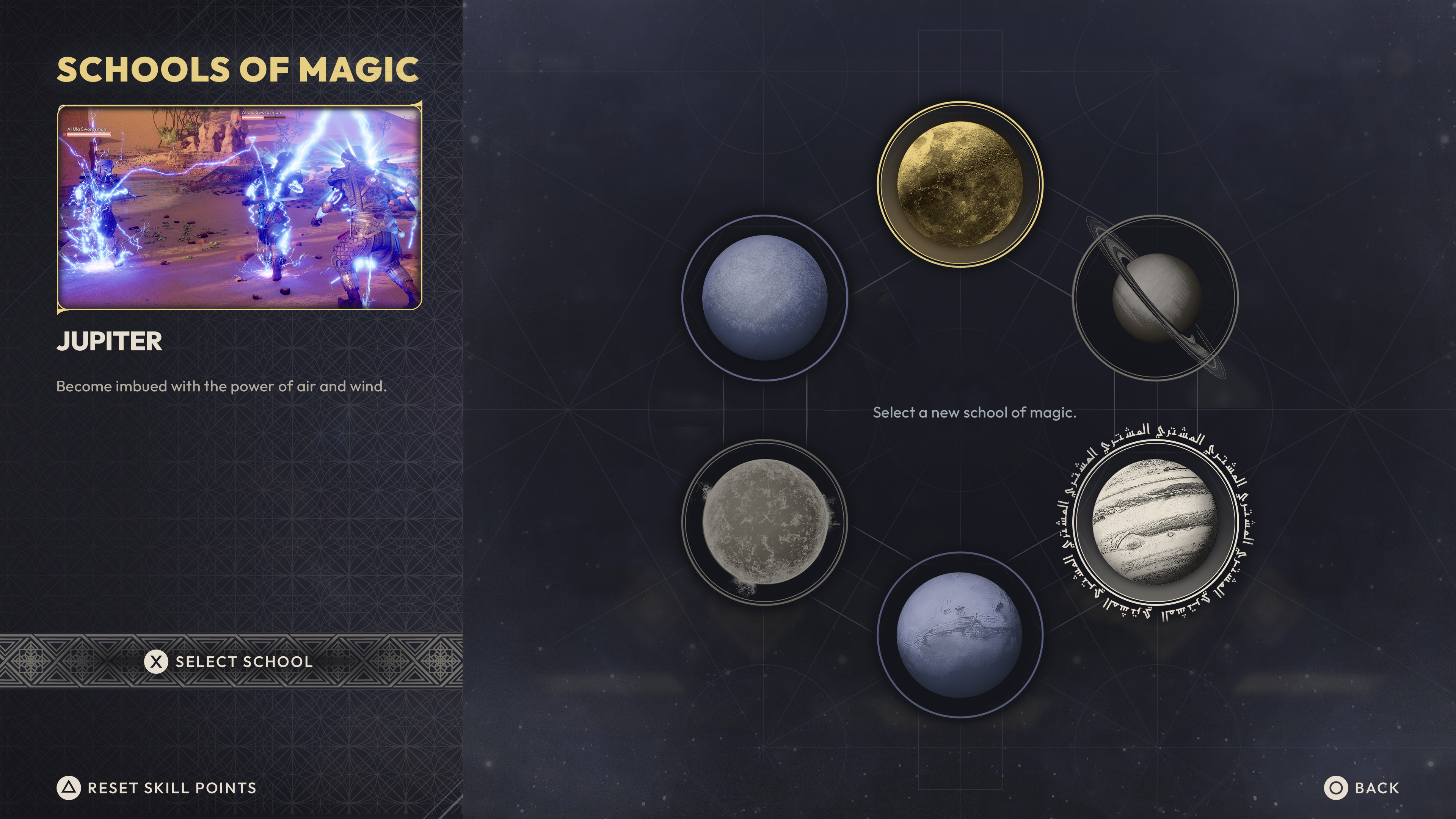
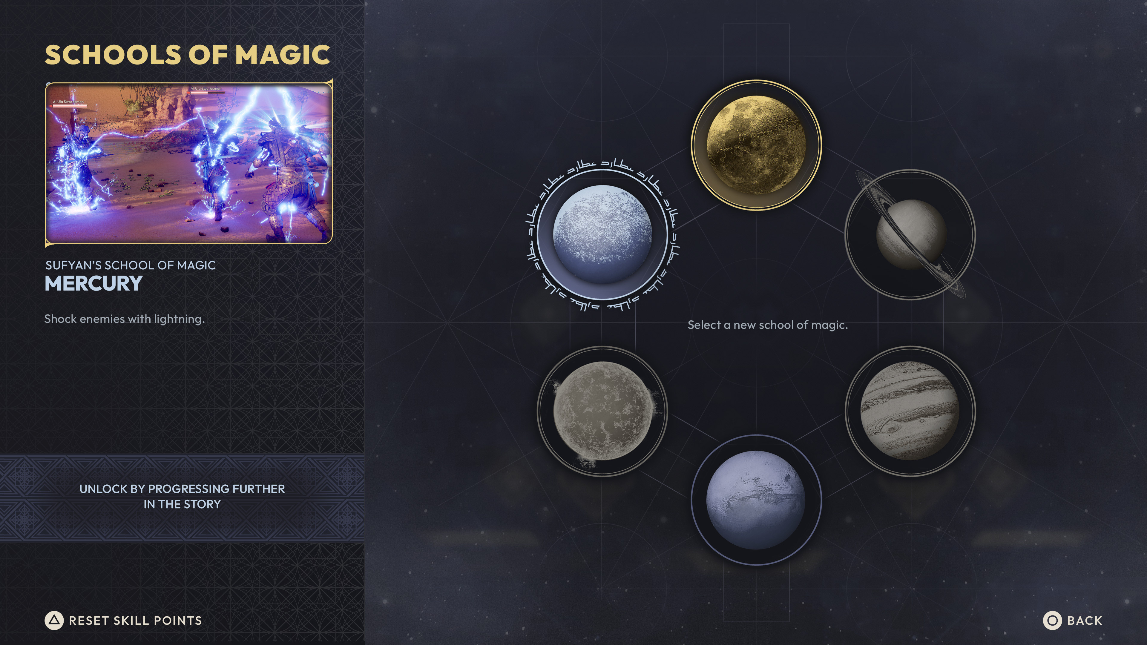
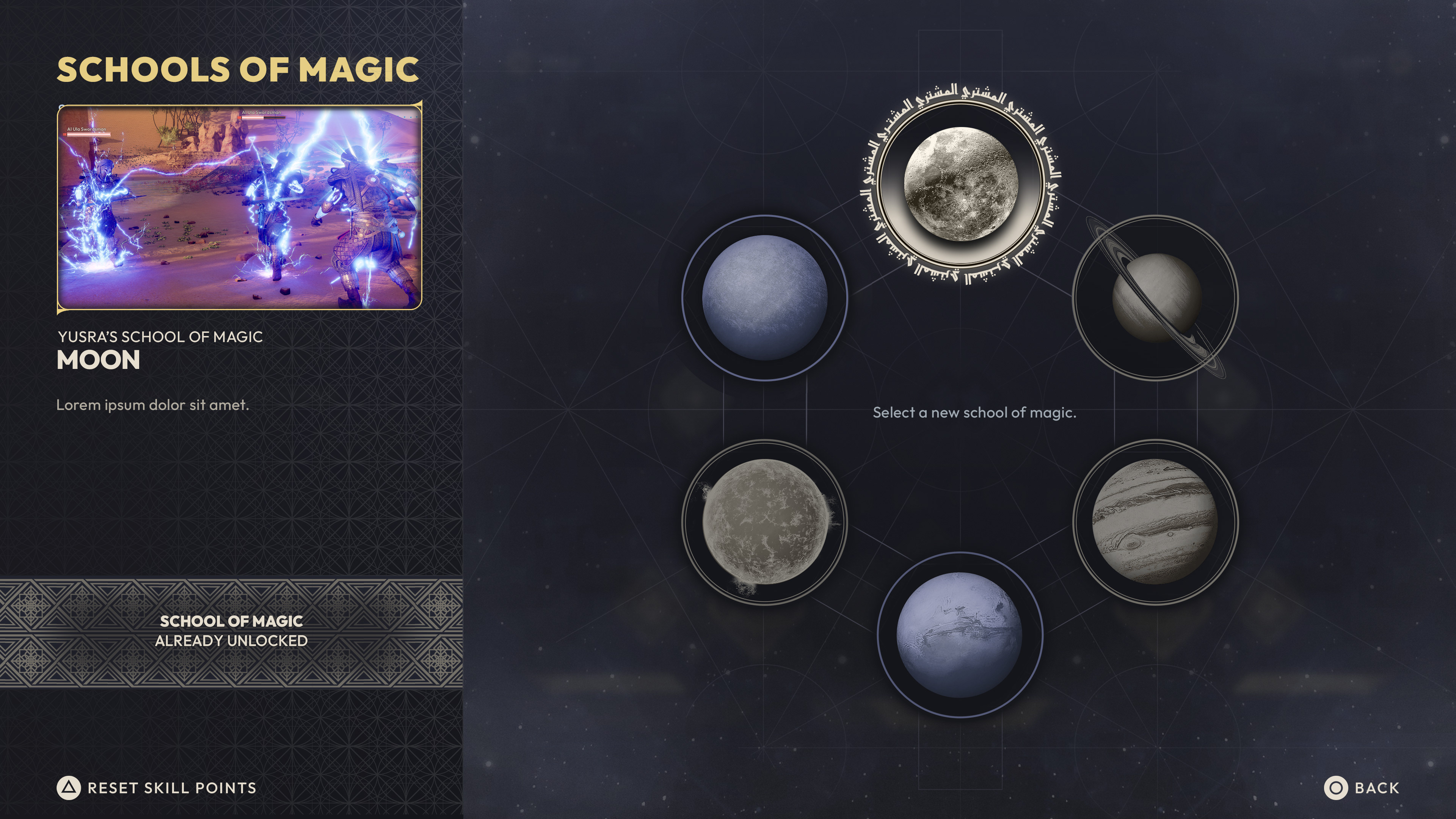
PAUSE/CHARACTER SCREEN
SCHOOLS OF MAGIC
_______________
From a design standpoint, Schools of Magic were still very much in the early/conceptual stages. I was asked to put together a screen that incorporated six unique planets (which would synergize) with other skills/abilities for each of the three playable characters. The info pane on the left side was a repurposed design element from the previous sets of screens - players would transition between their Skill Tree and Schools of Magic screens.