
LOGO
_______________
The treatment for the Dawn of Defiance logo was inspired by the silhouette shapes created by the ancient Greek ruins as well as the level design and architecture found within the game's environment and level design.


Below are several screenshots taken from the Early Access release of the game. These UI comps were designed and implemented during the later stages of development - alongside sweeping changes across both Game / Art Direction.
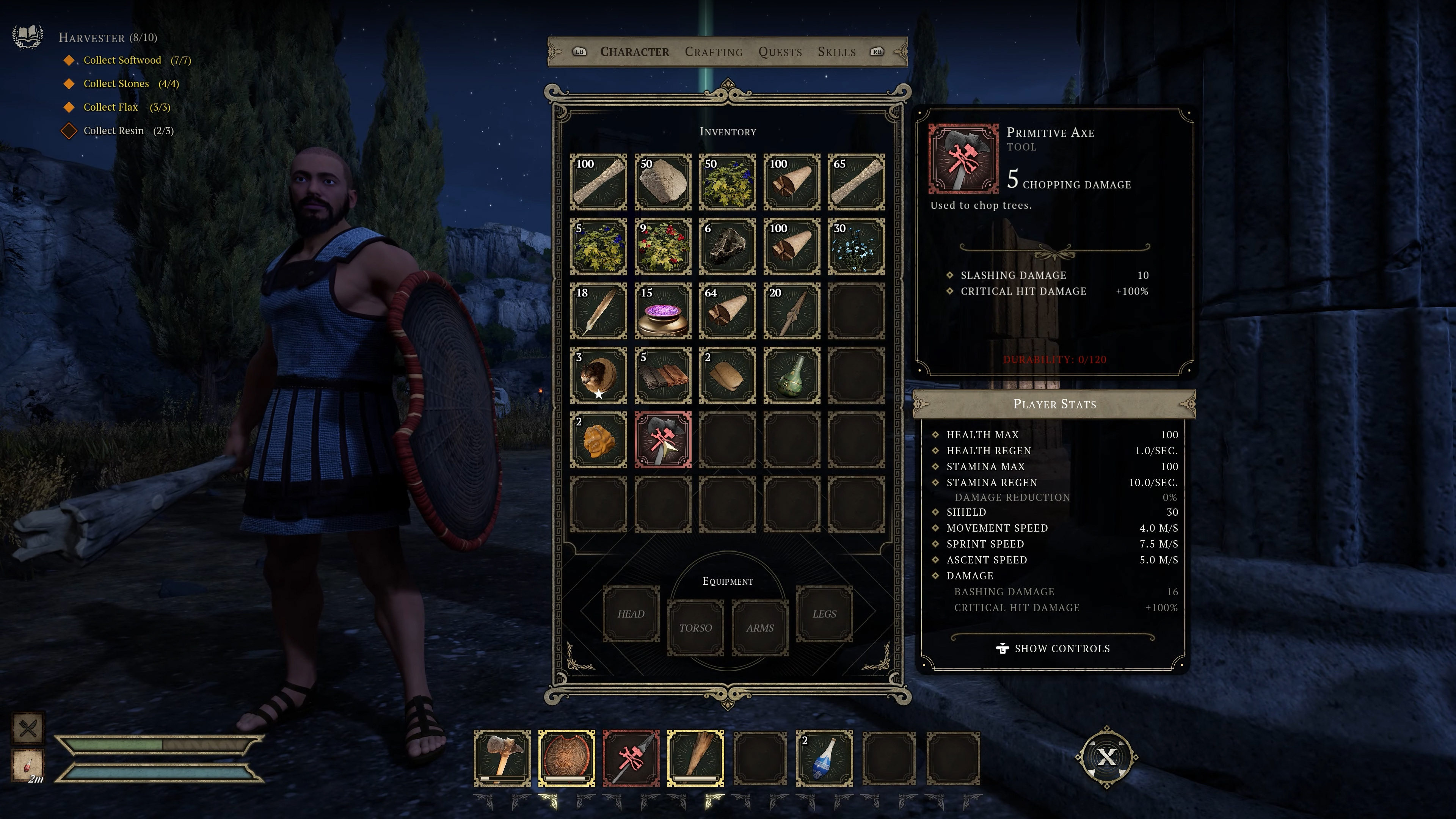
CHARACTER SCREEN

CRAFTING SCREEN


SKILLS SCREEN


CHEST POPUP

MOTION COMPOSITIONS
PRE-PRODUCTION
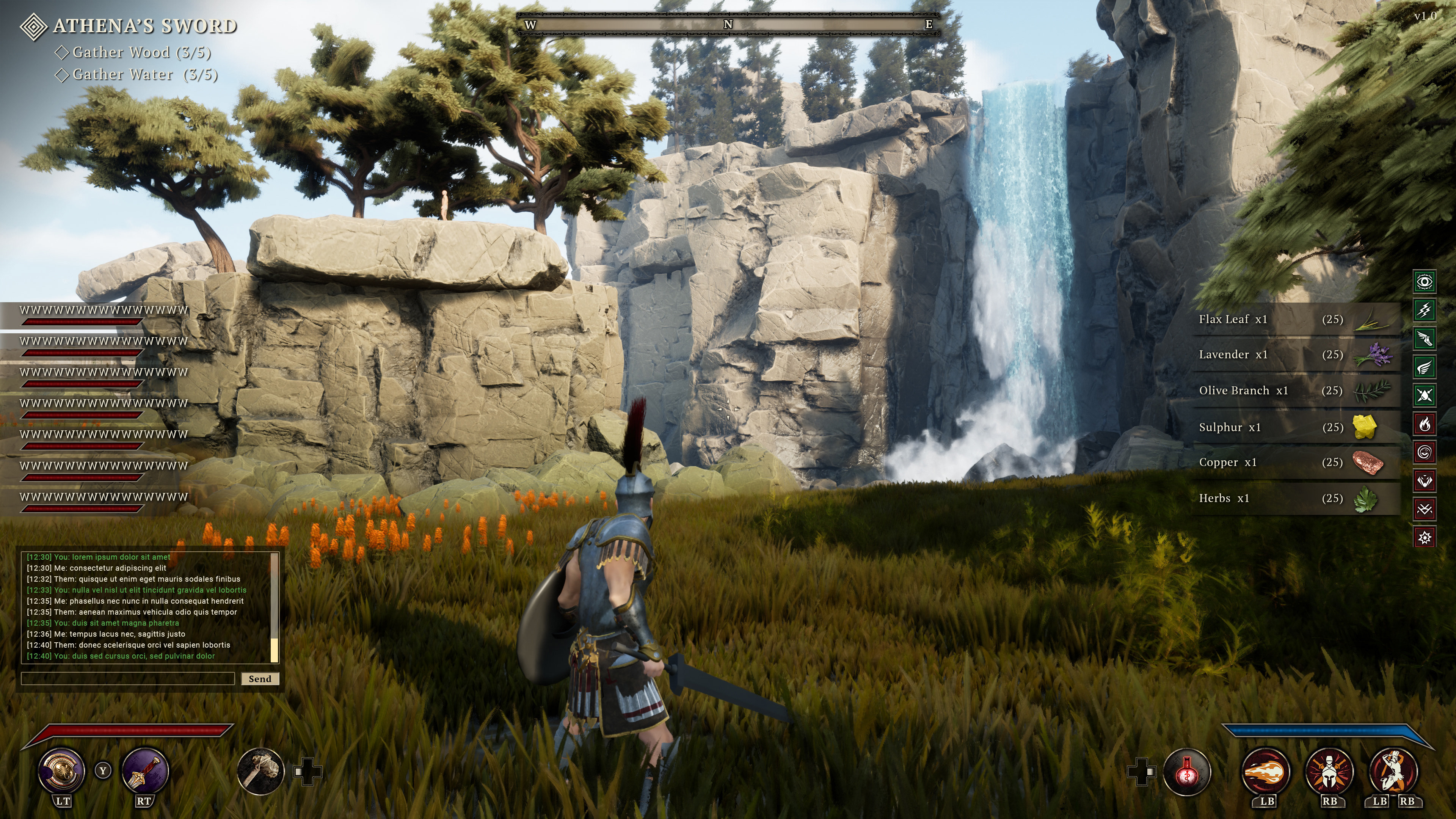
HUD
_______________
Below are a few screenshots taken from an early version of the game. These HUD comps were working as prototype versions for several months prior to changes in Art Direction.

PRE-PRODUCTION
ICONOGRAPHY


PRE-PRODUCTION
BLADE UI
_______________
The Blade UI in Dawn of Defiance was initially conceived as a fullscreen experience. Player's would have control over the density of information presented on screen, control the transparency of the vignette -all while having a game that is still actively running in the background.
Flanking the character on either side around the inner circle are Weapons and Armor. The outer perimeter presents Tools and Spells/Abilities. Stats and Status are displayed along the bottom portion of this screen.


During development, a change to our Blade UI was underway. We pivoted from a fullscreen UI to an in-world presentation. Our goal with this update was to retain as much immersion as possible - removing the vignette. This change proved to be successful and was a great decision from our designers.


PRE-PRODUCTION
UI STYLE GUIDE
_______________
Early on in development during the initial pre-production phase, several slides were put together to showcase a potential visual direction for the UI in Dawn of Defiance. Heavy contrast of light & dark found from films such as 300 and borrowing heavily from Ancient Greek myth, the slides below were our initial look / feel.
For our game to stand out from other titles set in Ancient Greece, we landed on a color palette of Gold & Blue hues with warmer tones to help bring balance.
Ultimately, our game received a visual overhaul and introduced a new Art Director late in development, which shifted the overall tone of the game as well as impacting the style & direction of the UI to more traditional colors found from Ancient Greece.


